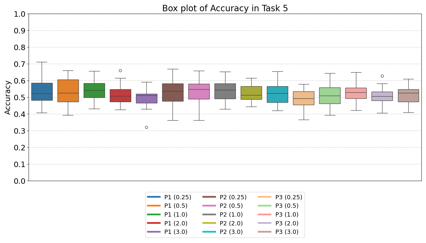
Experimental Results of PAMAP2 Dataset
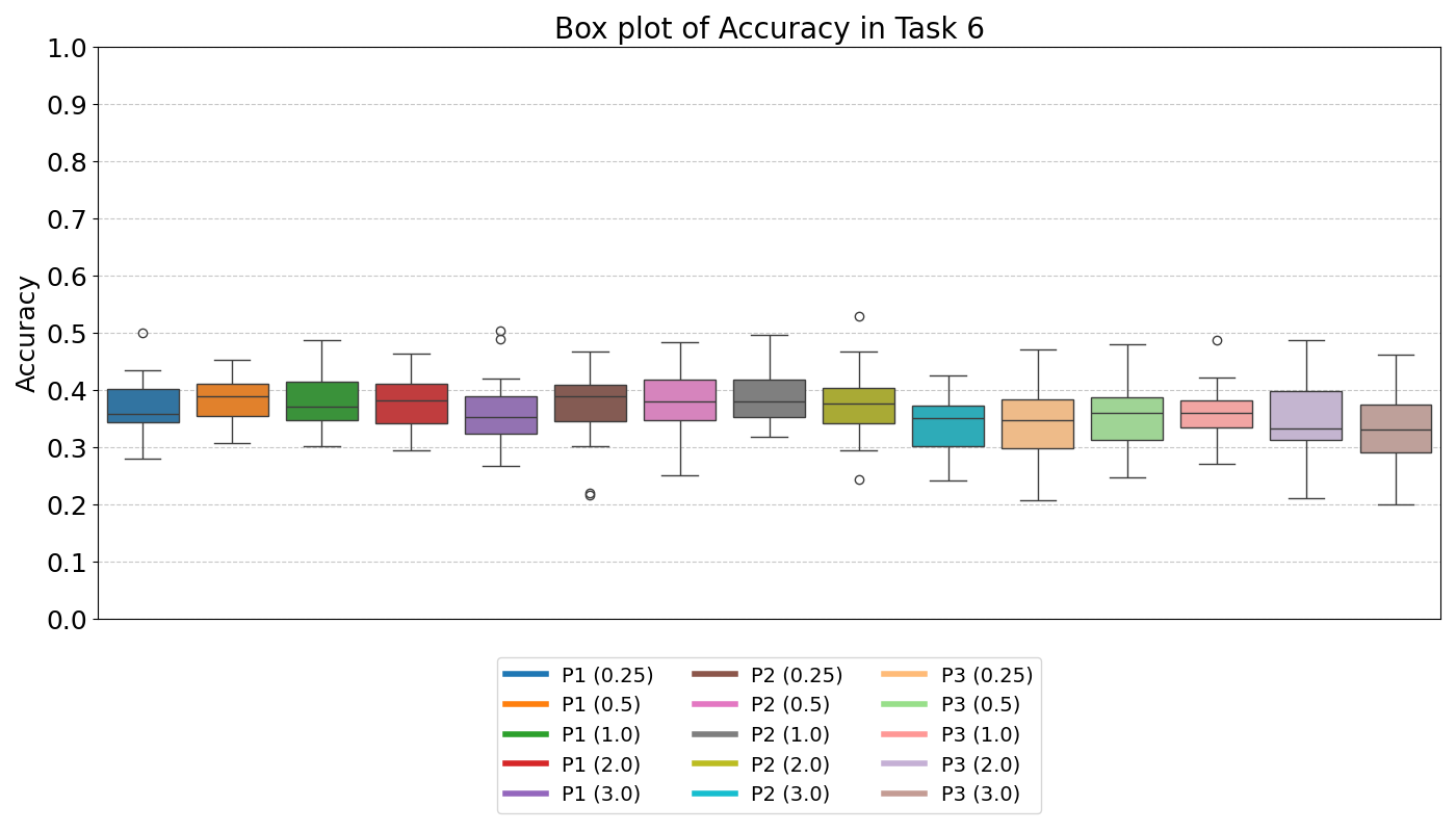
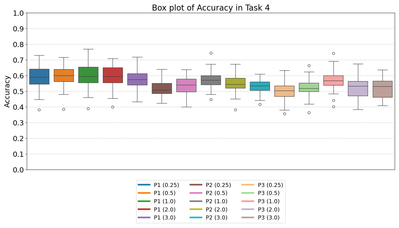
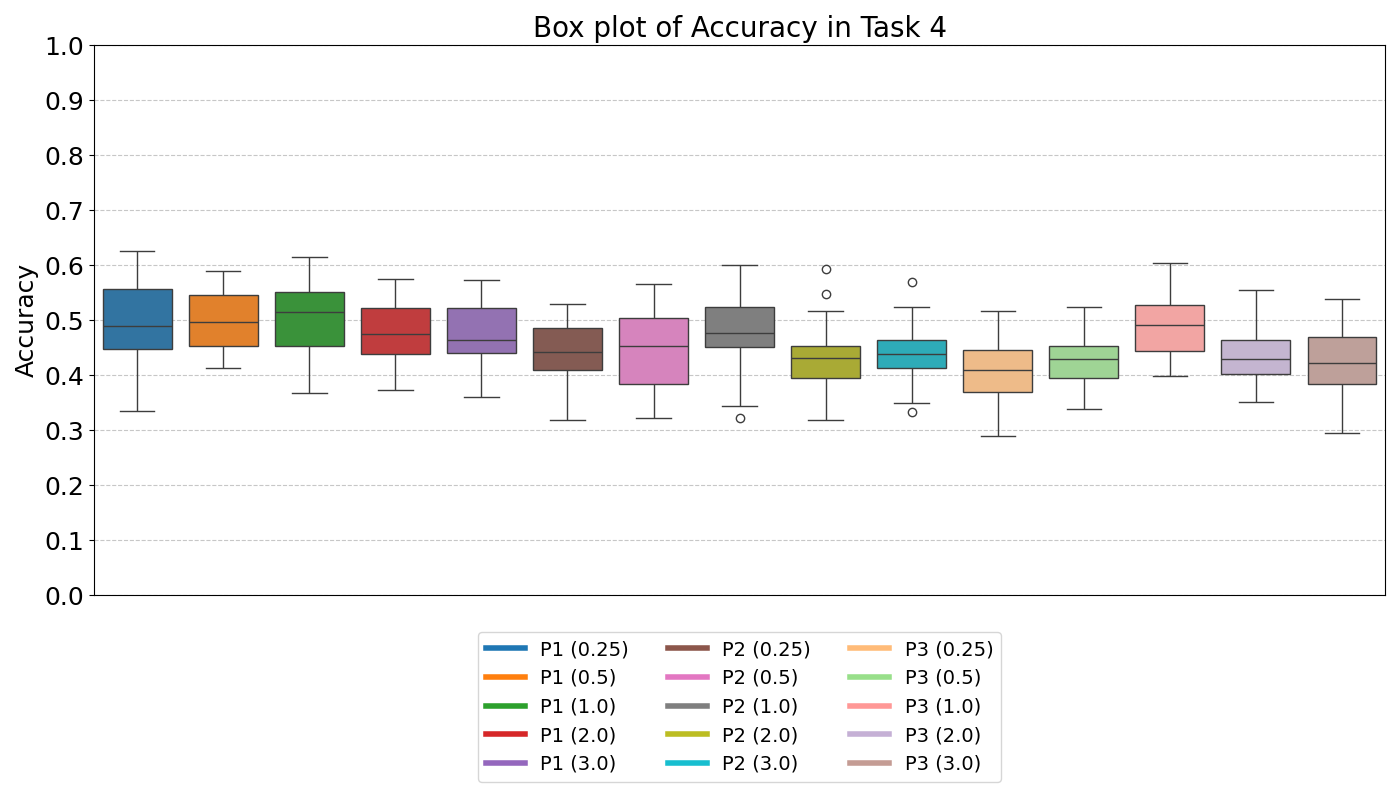
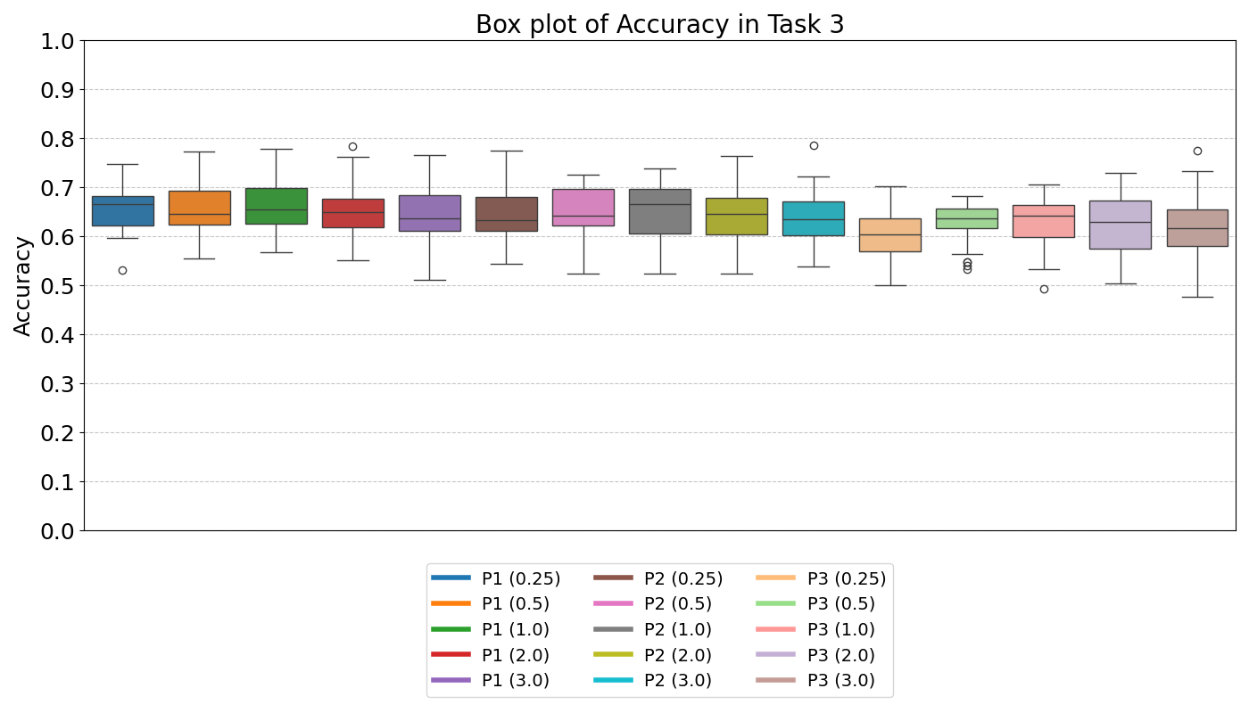
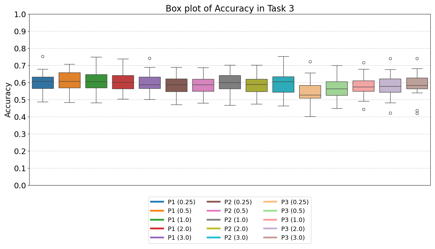
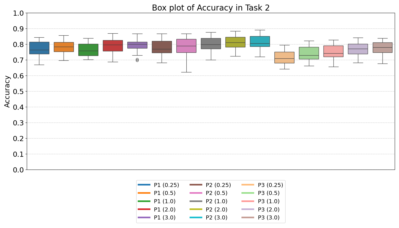
Box Plot of Accuracy for All Classes by Tasks
The box plots illustrate the accuracy of all classes in the final task for participants (P0, P1, P2) over 30 runs in each scenario.
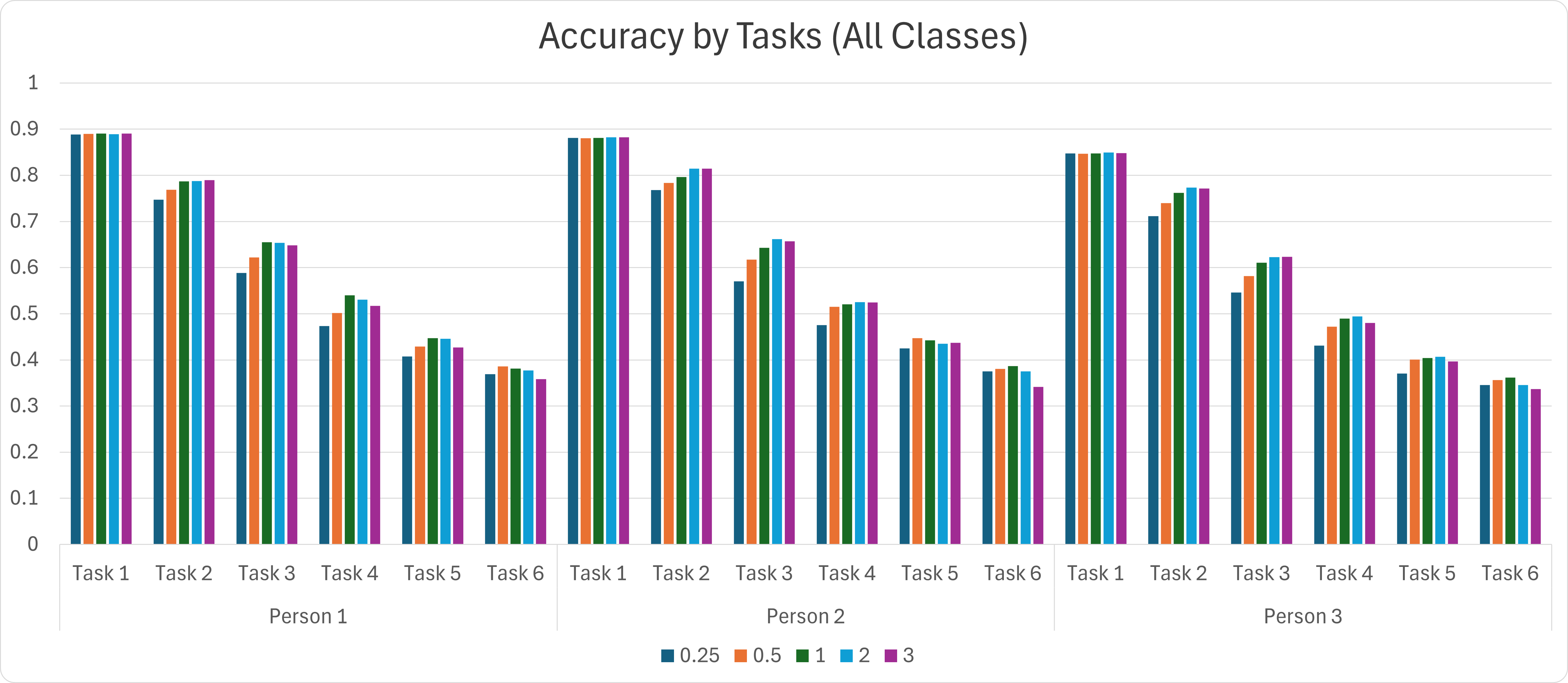
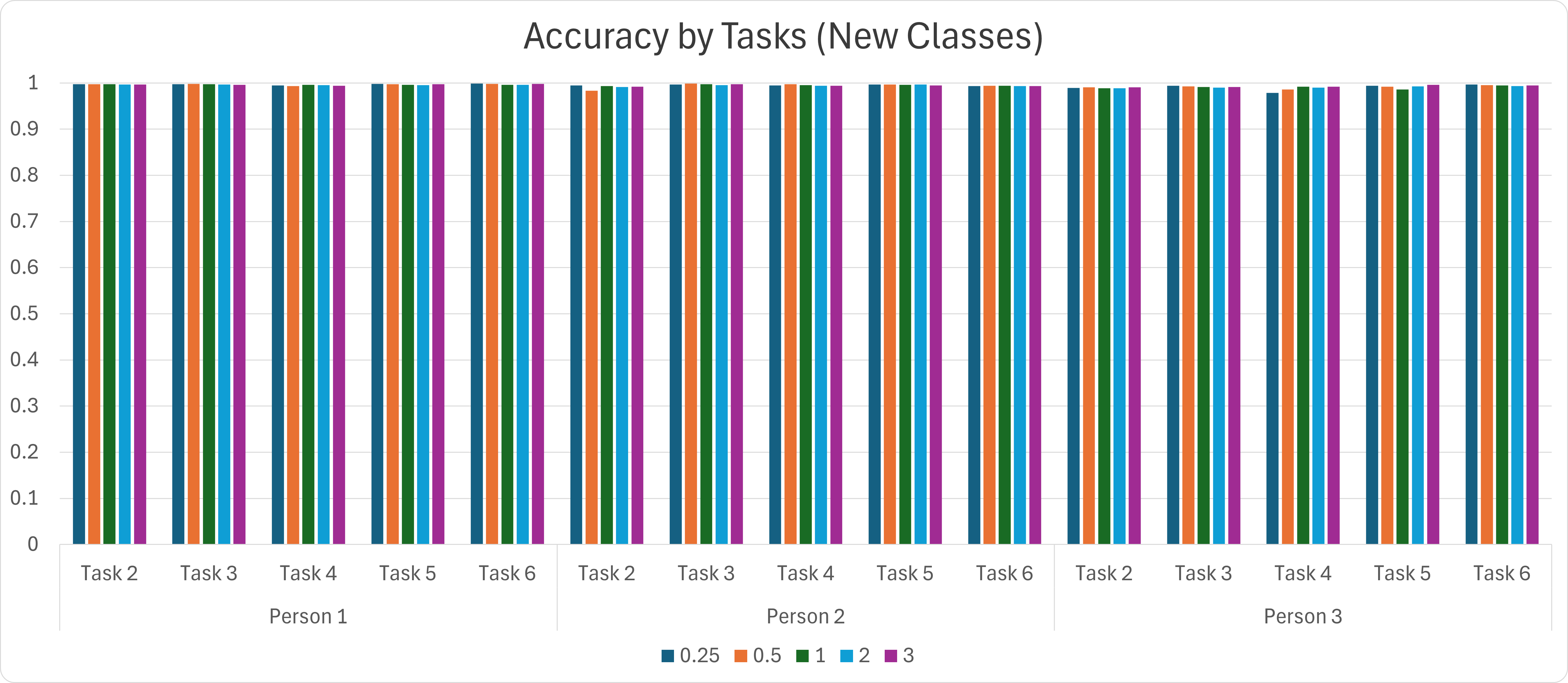
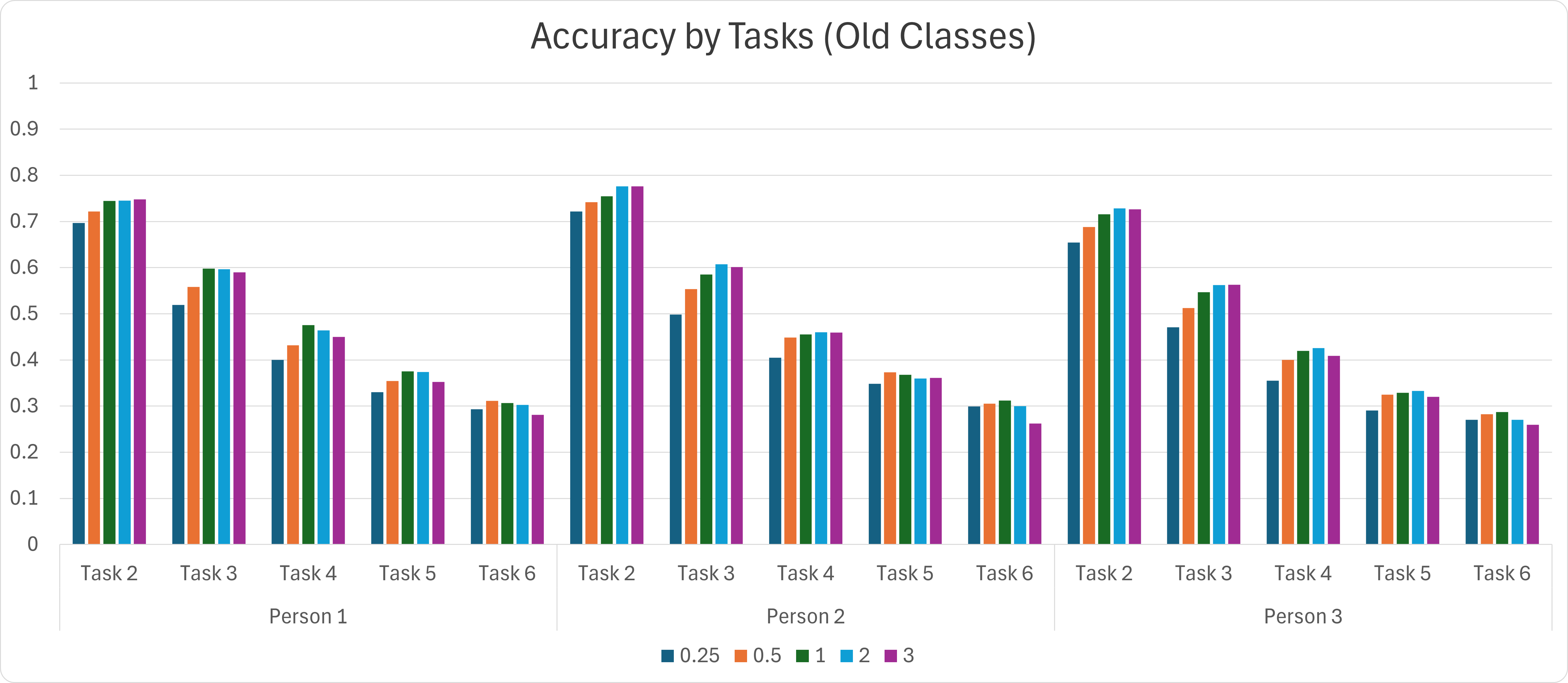
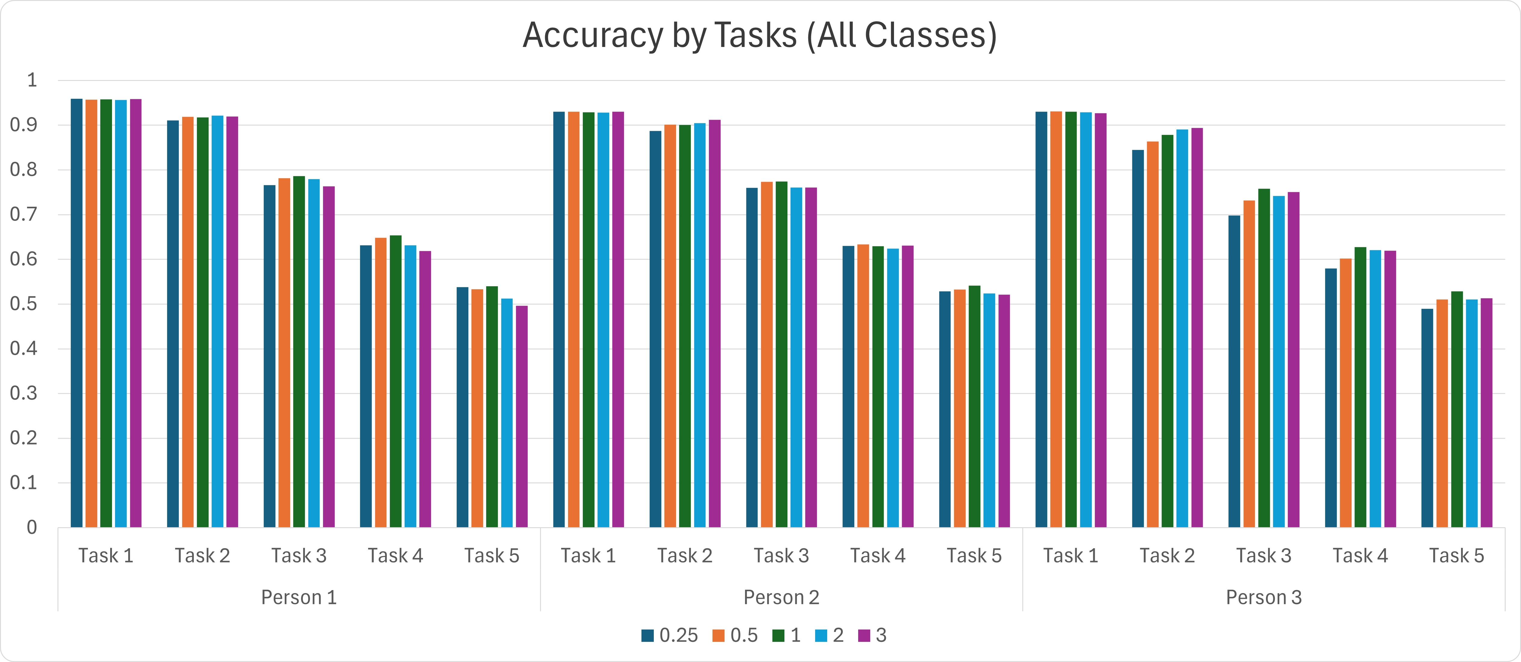
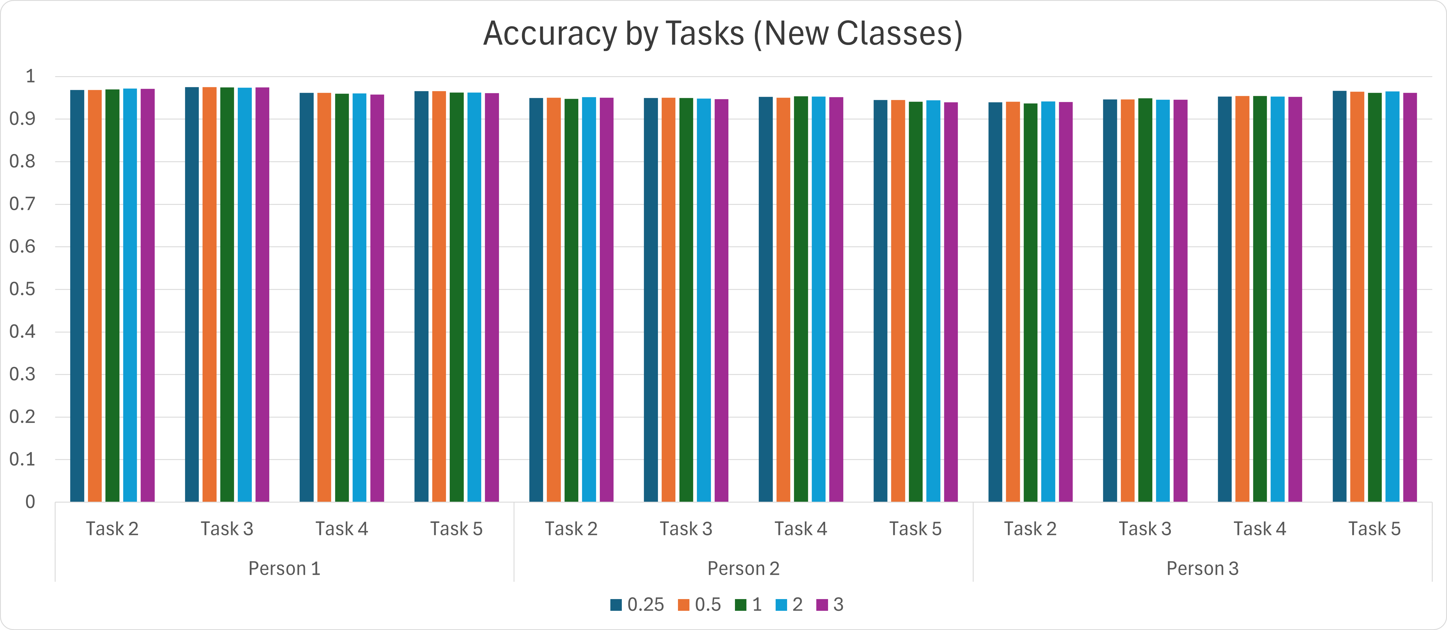
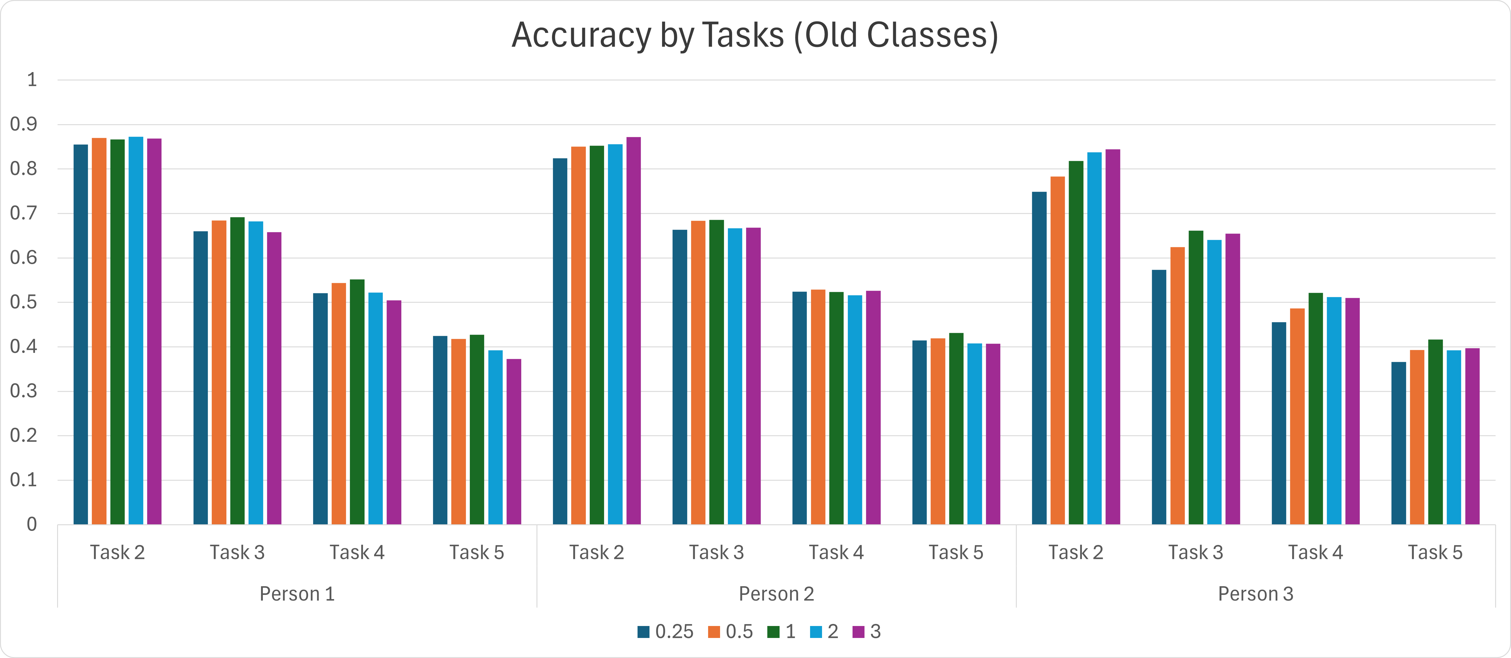
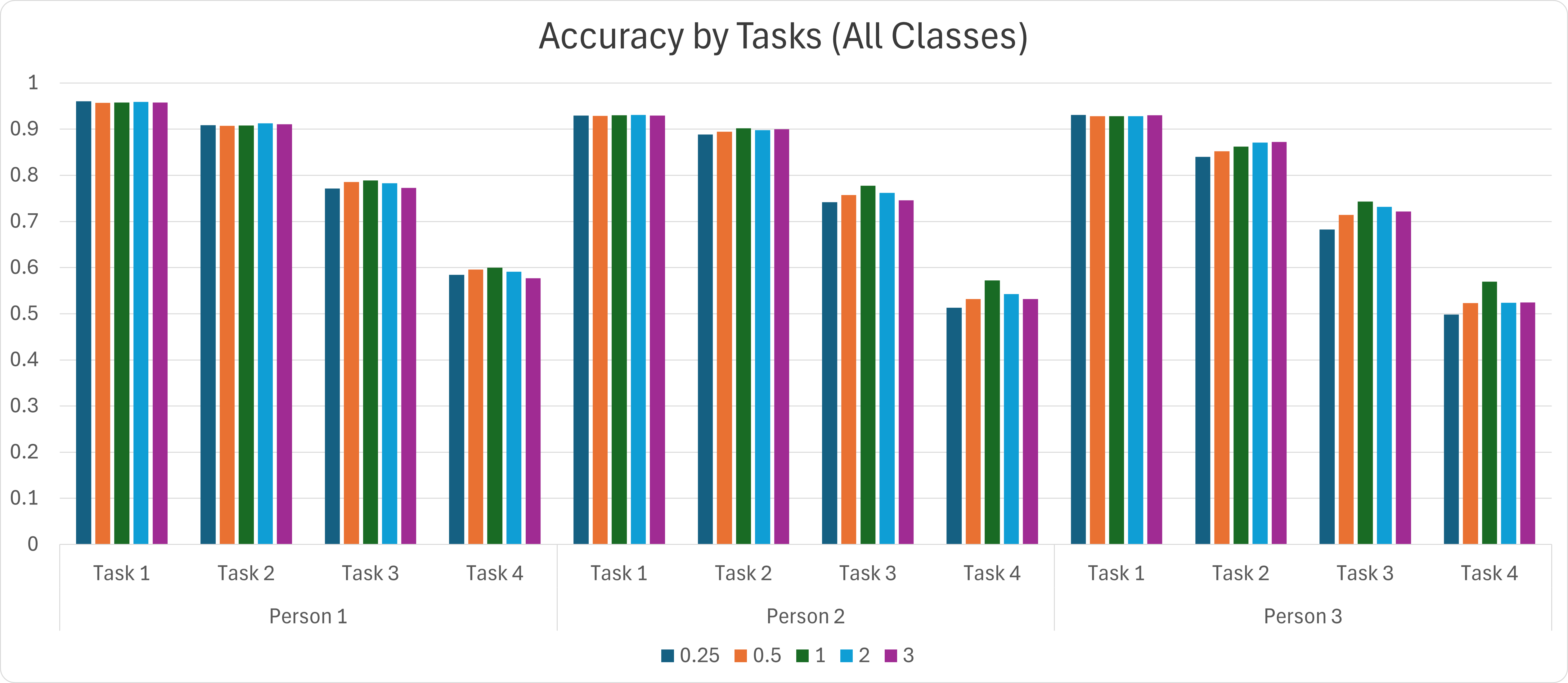
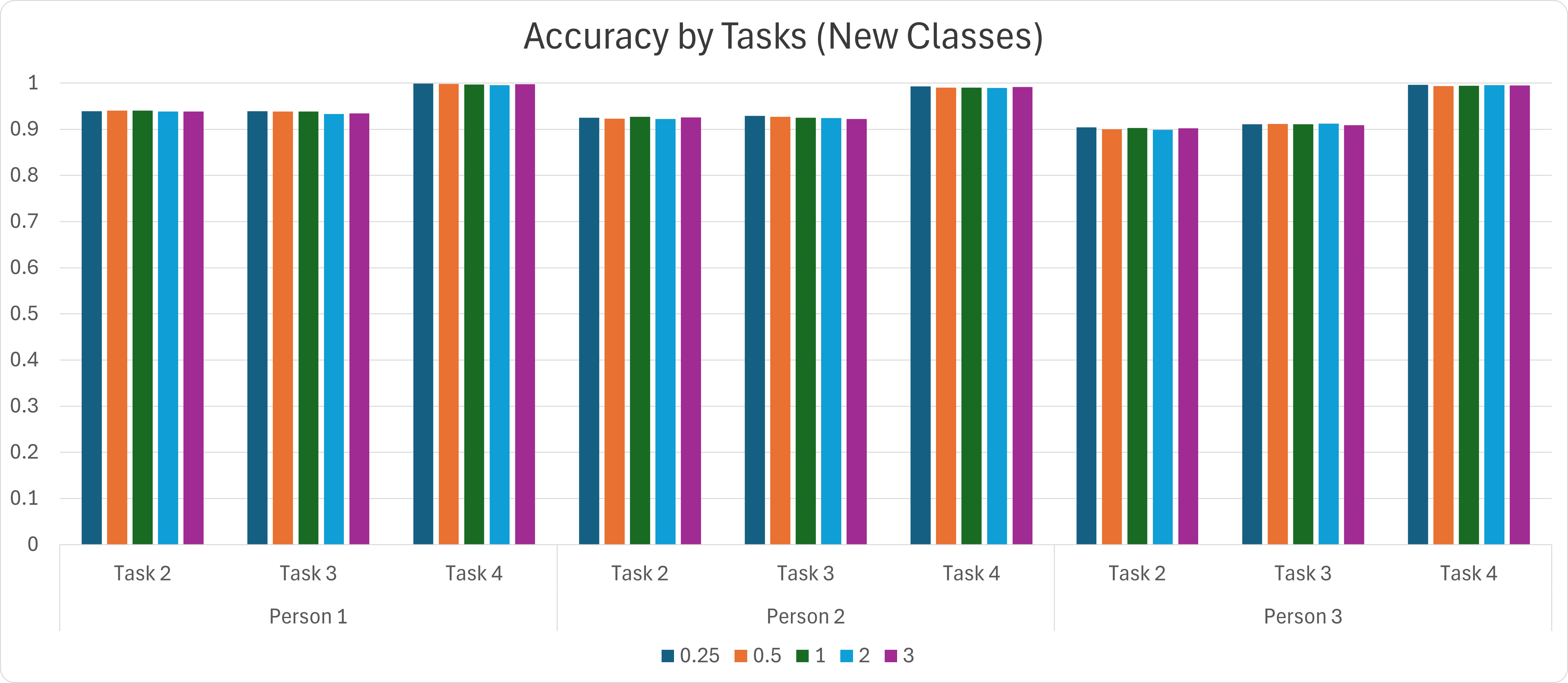
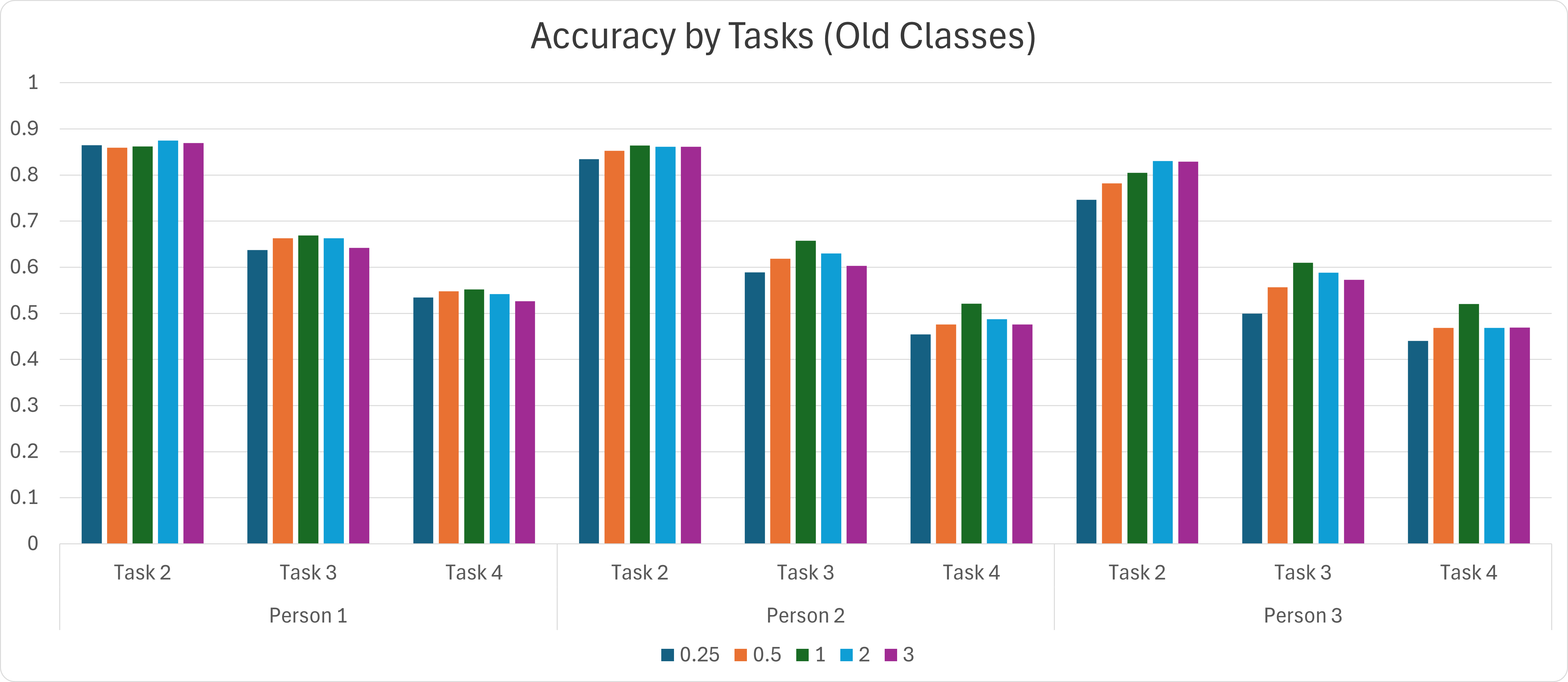
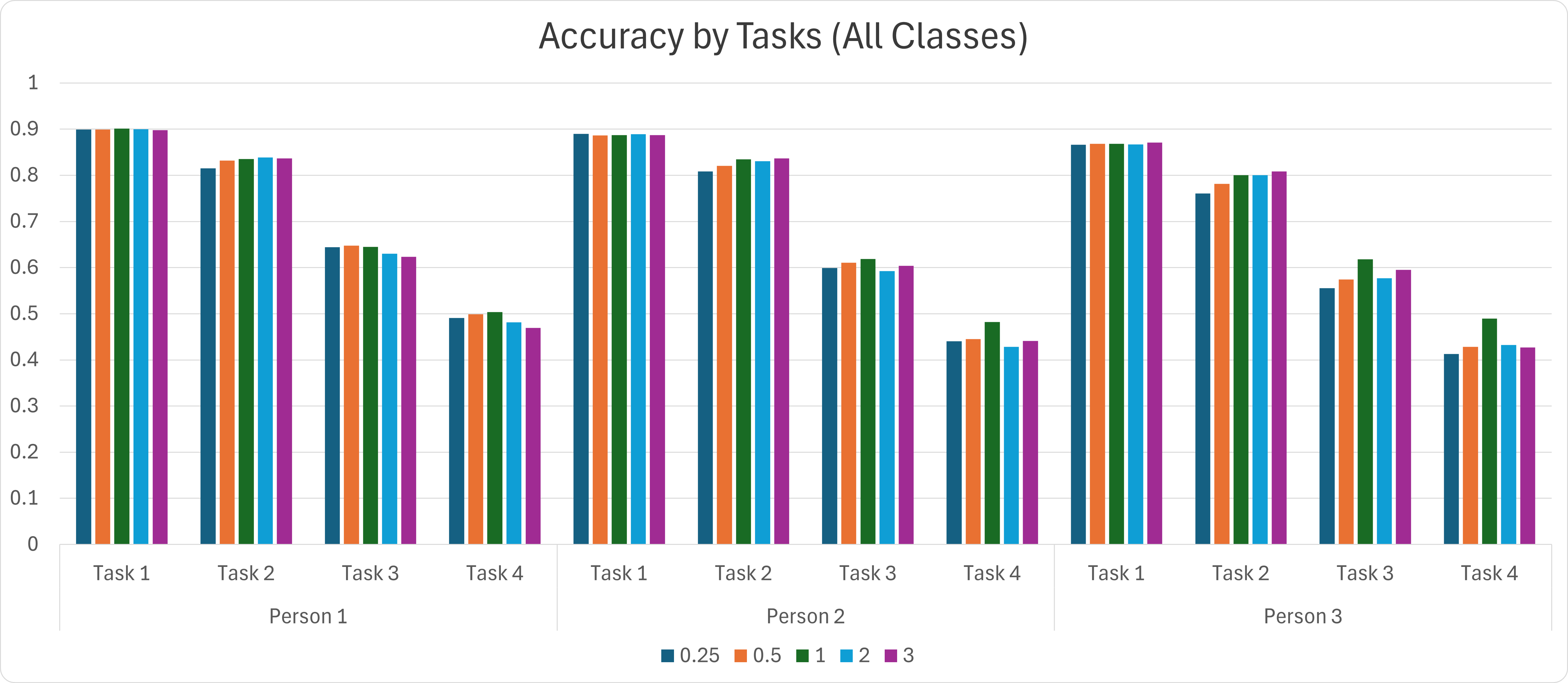
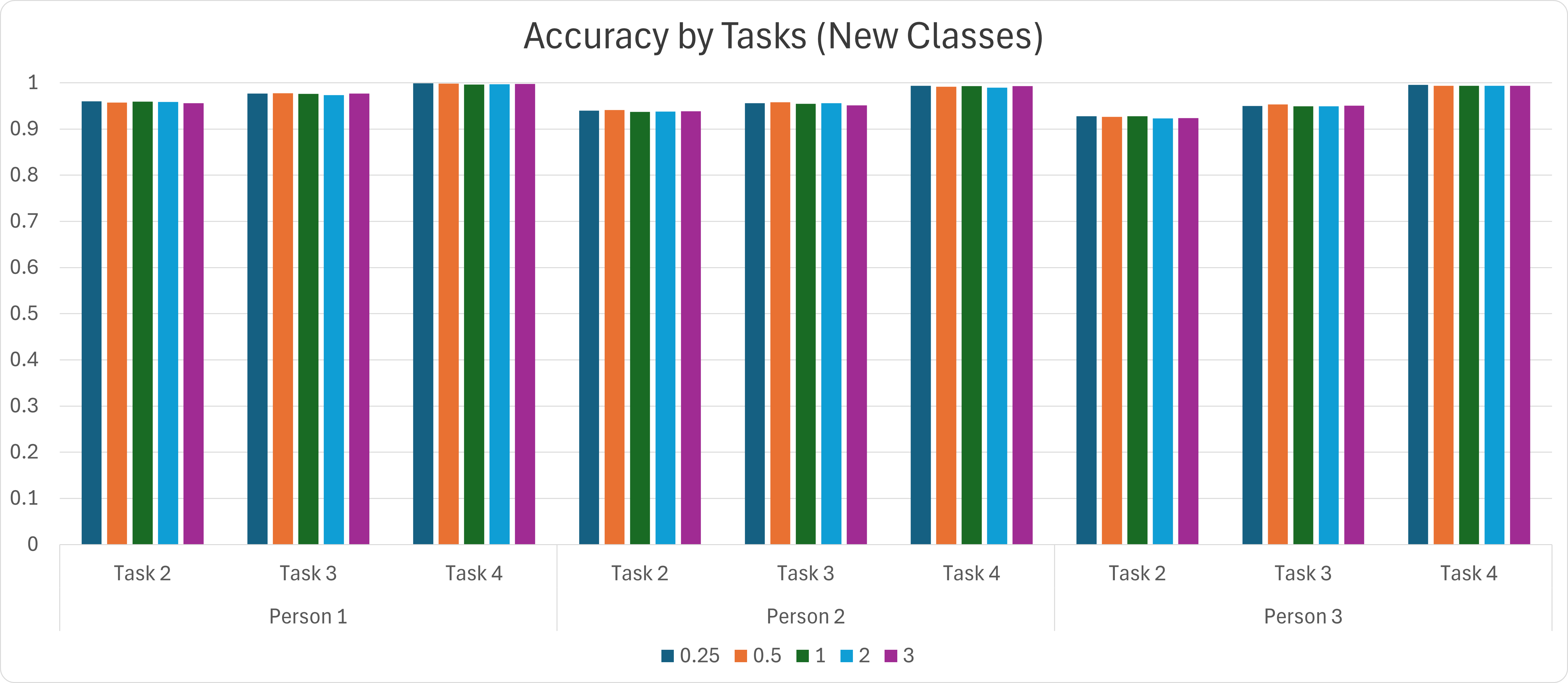
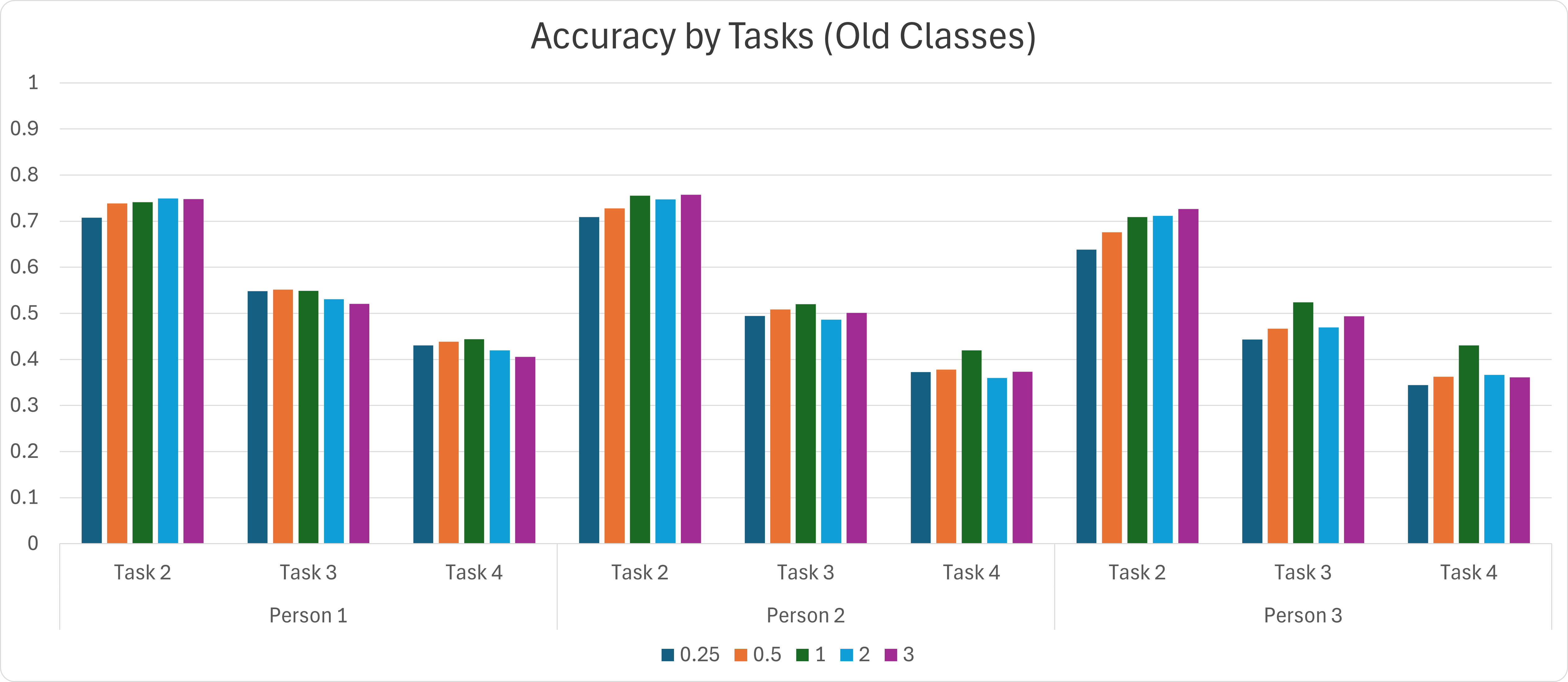
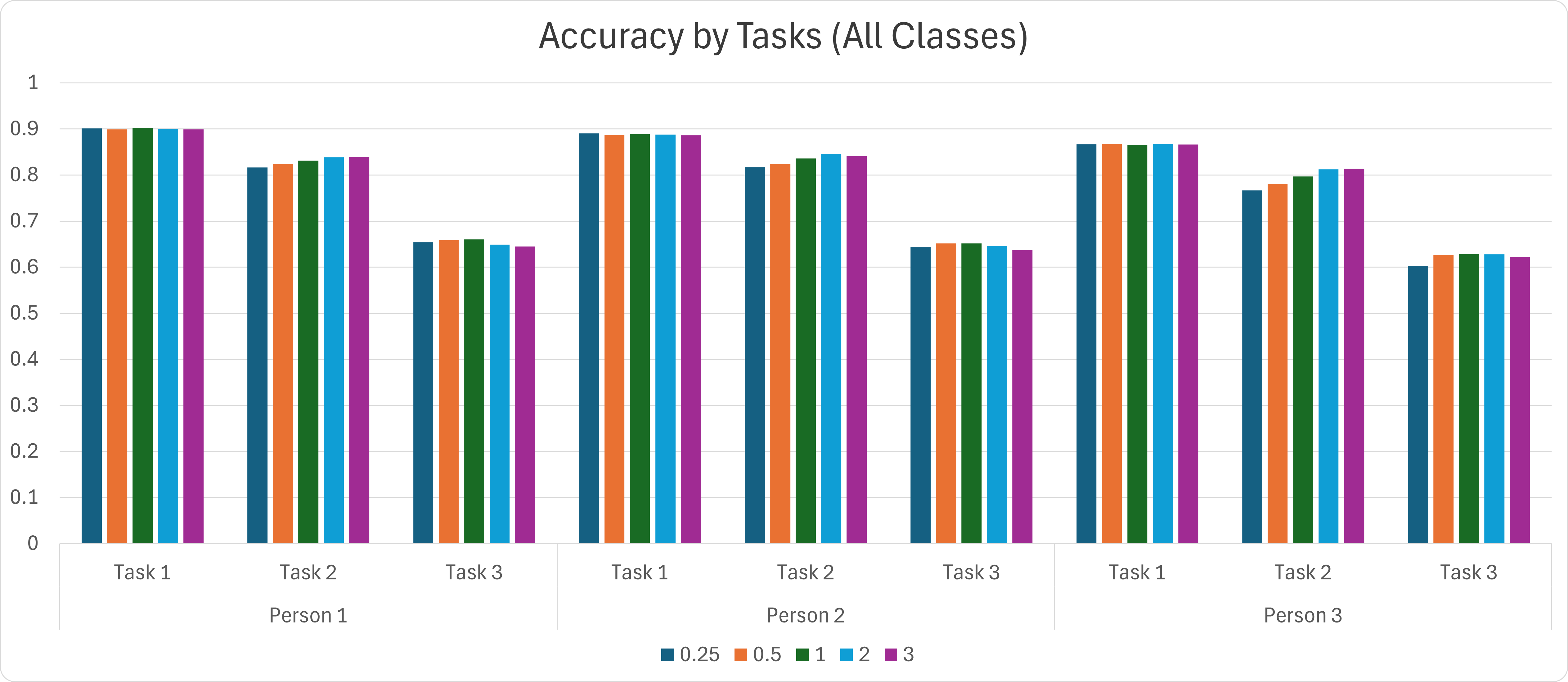
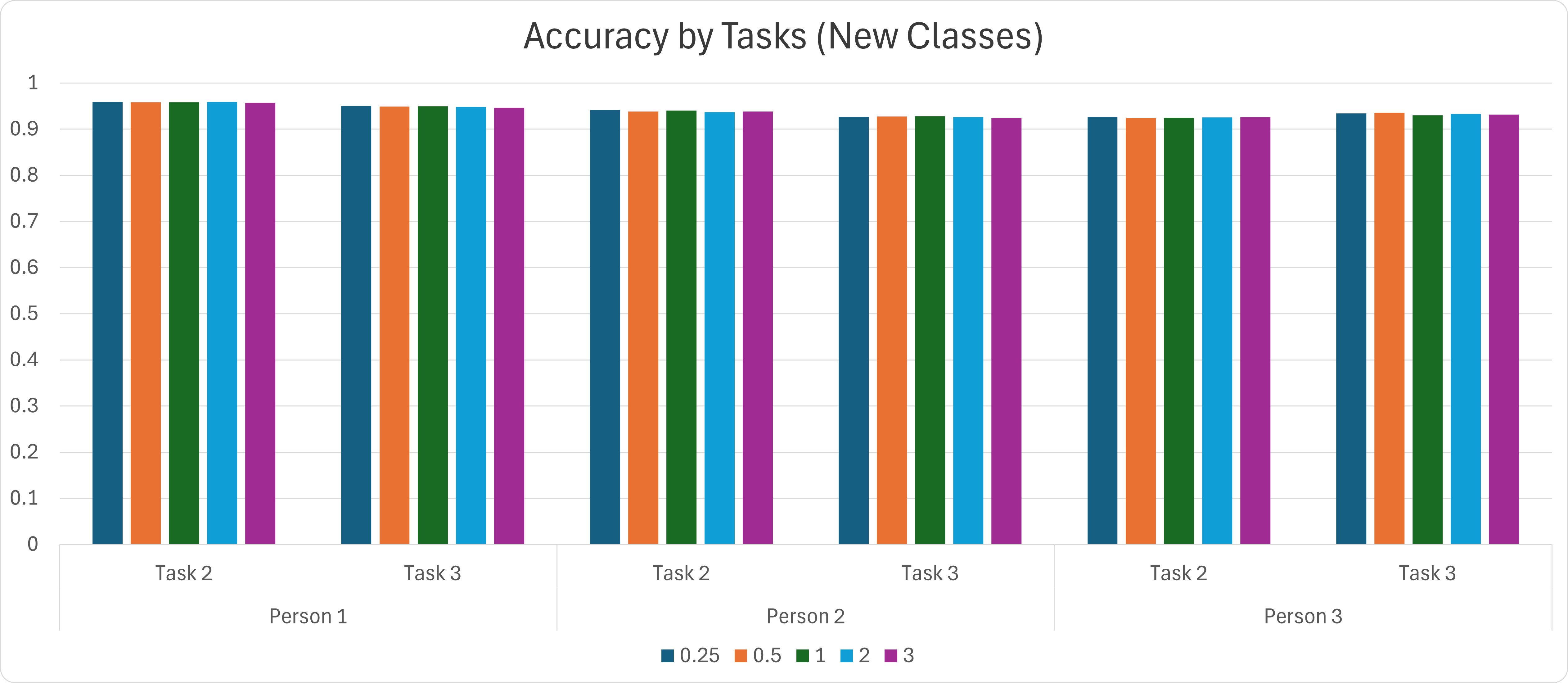
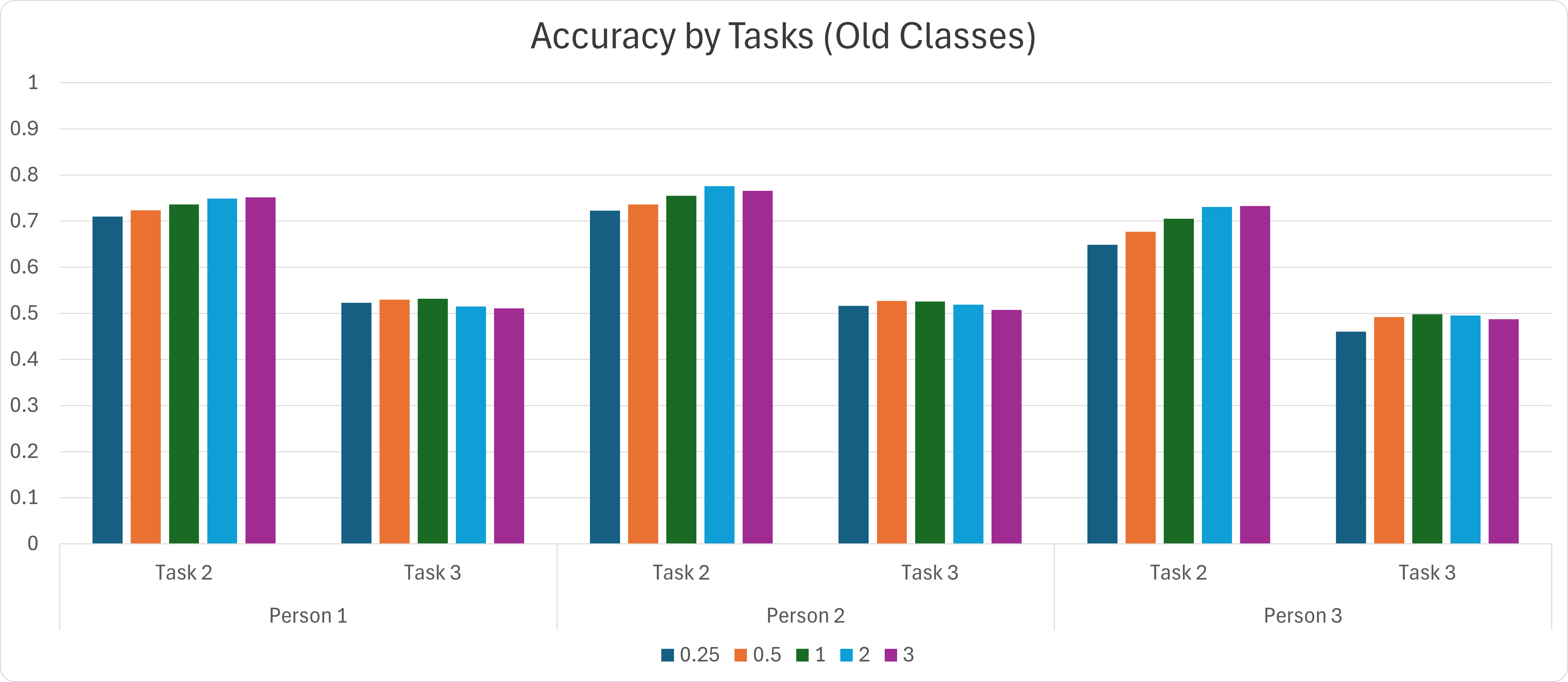
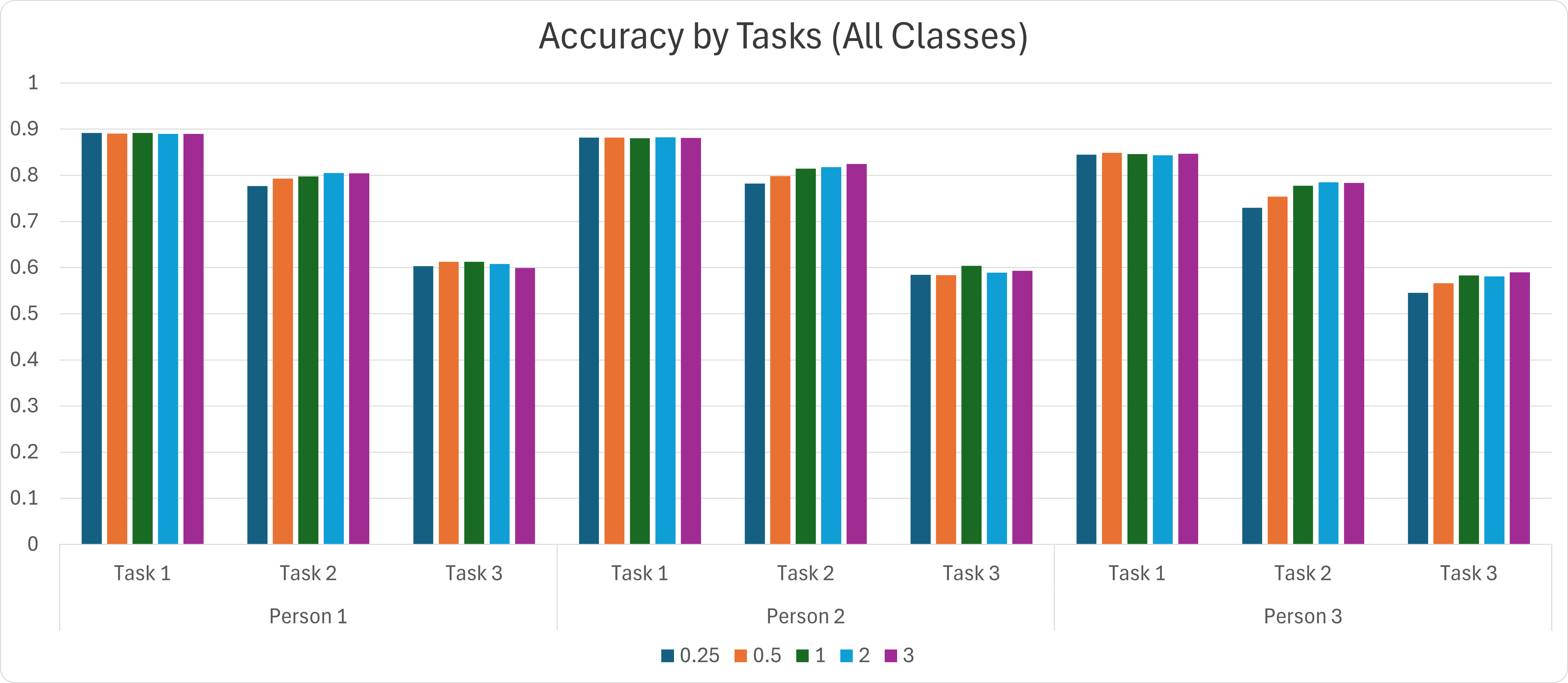
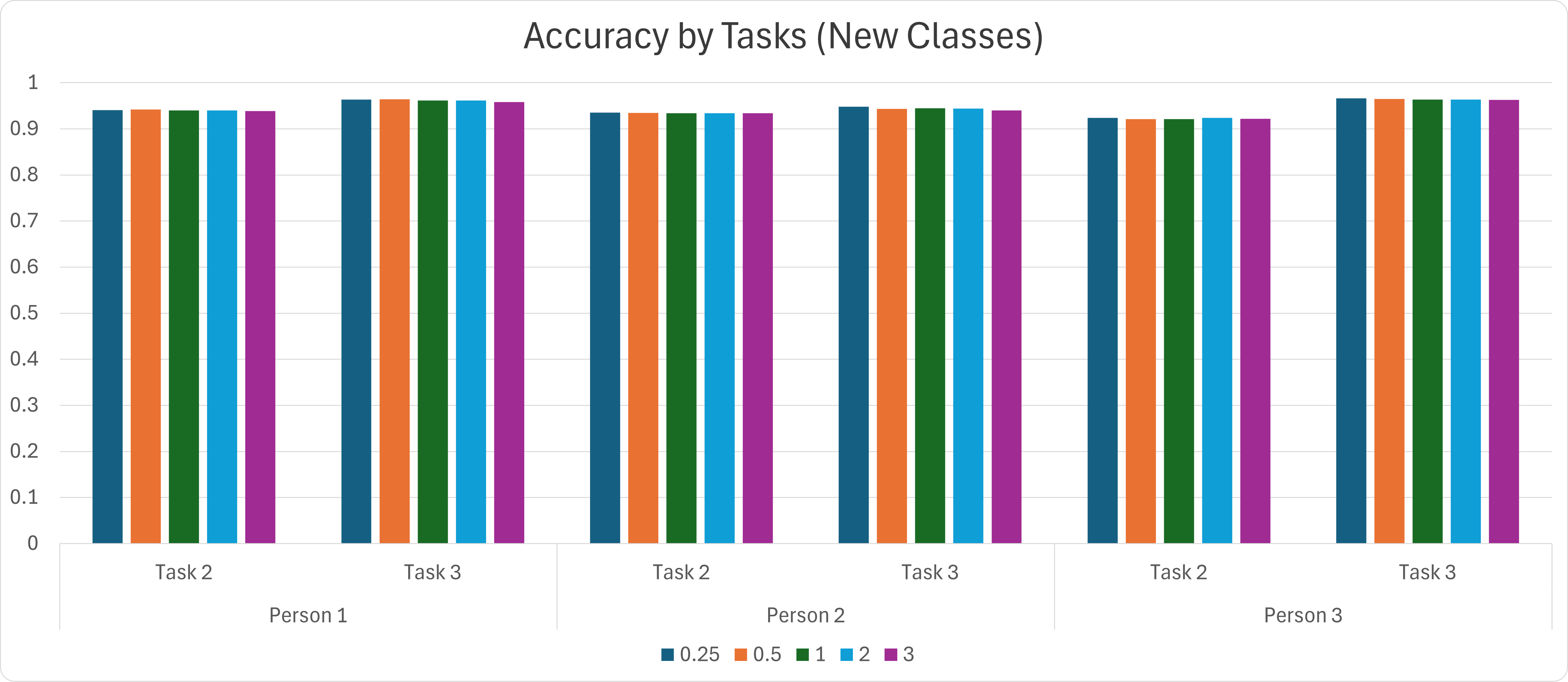
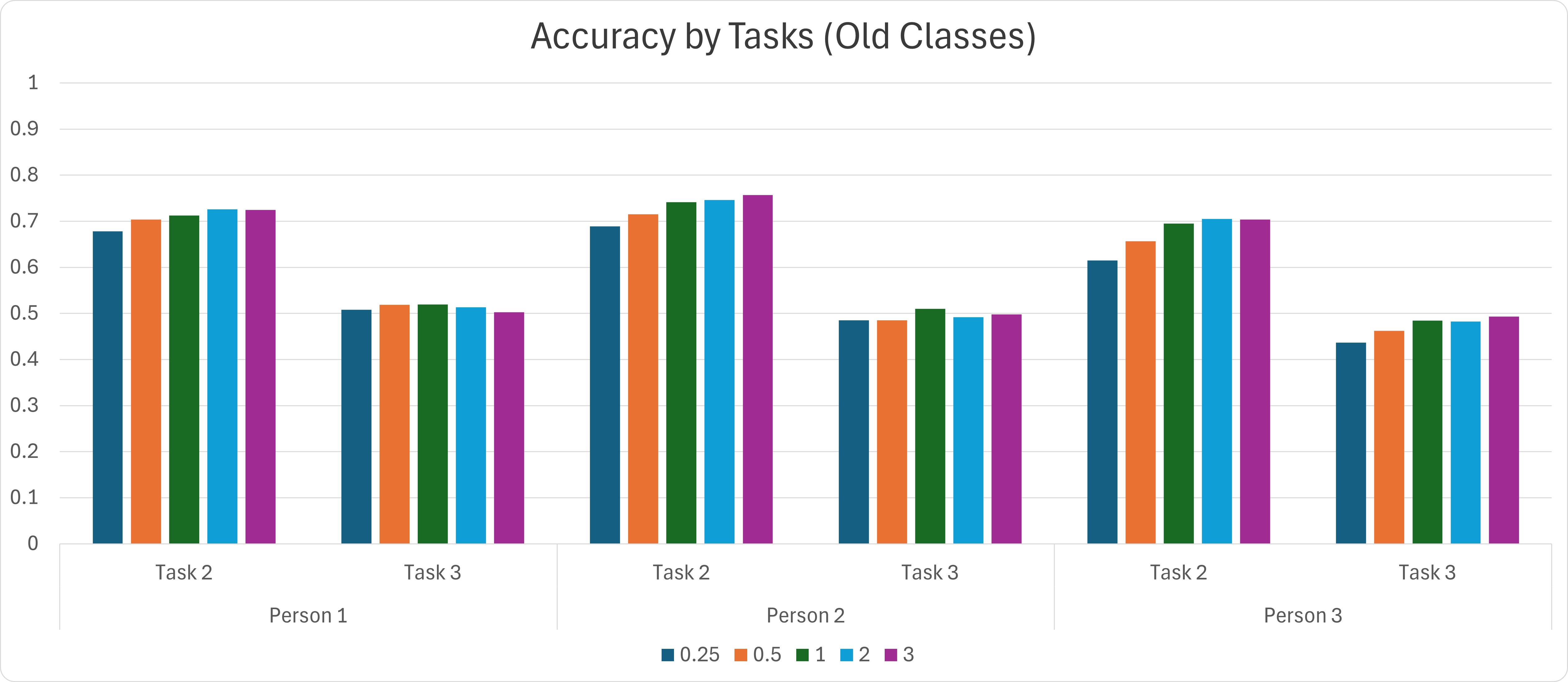
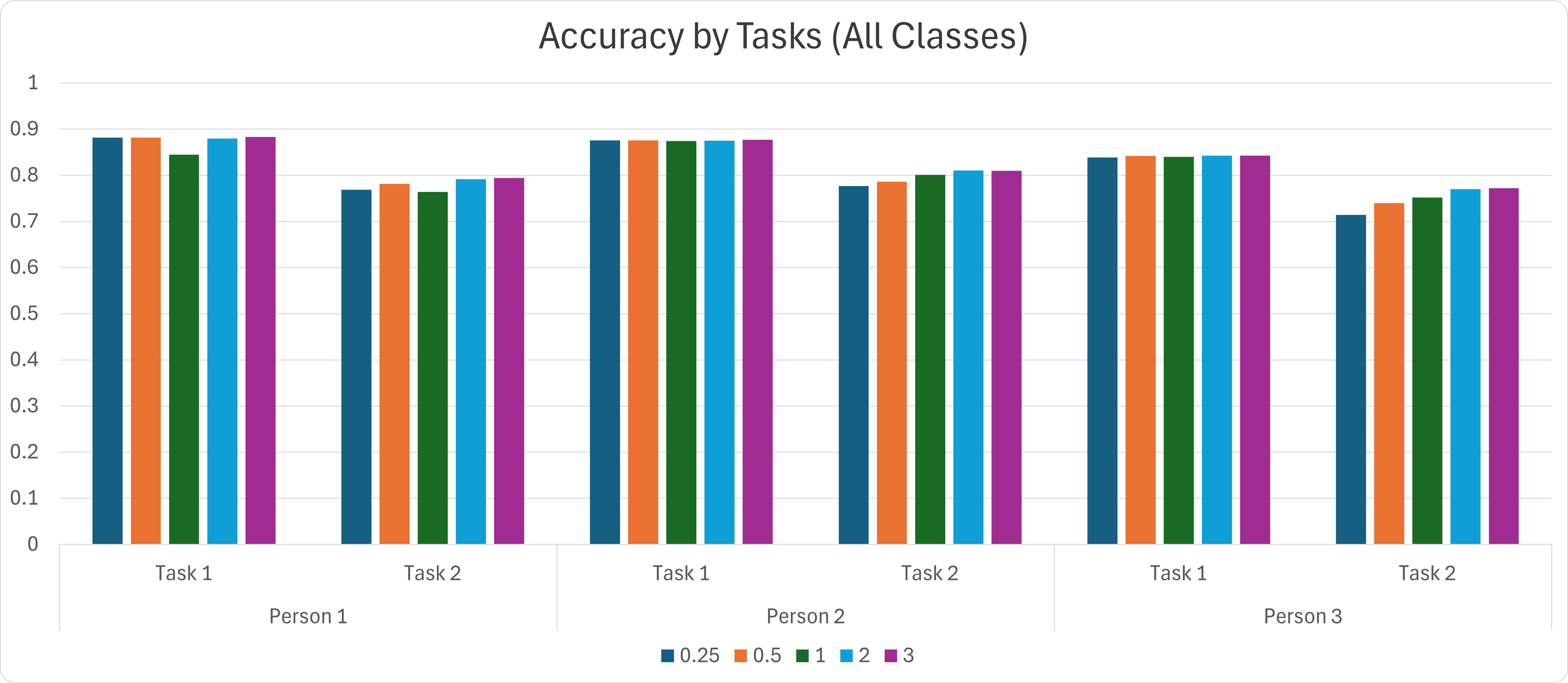
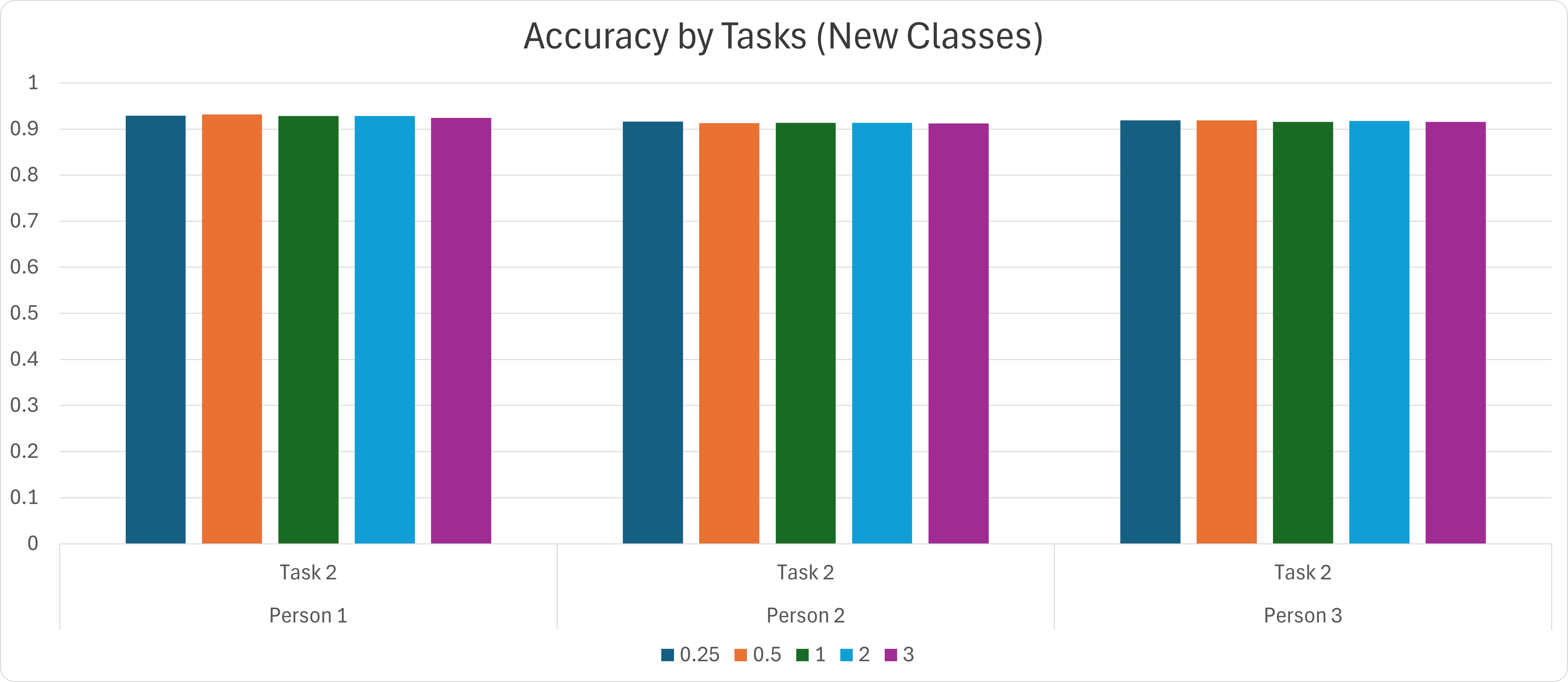
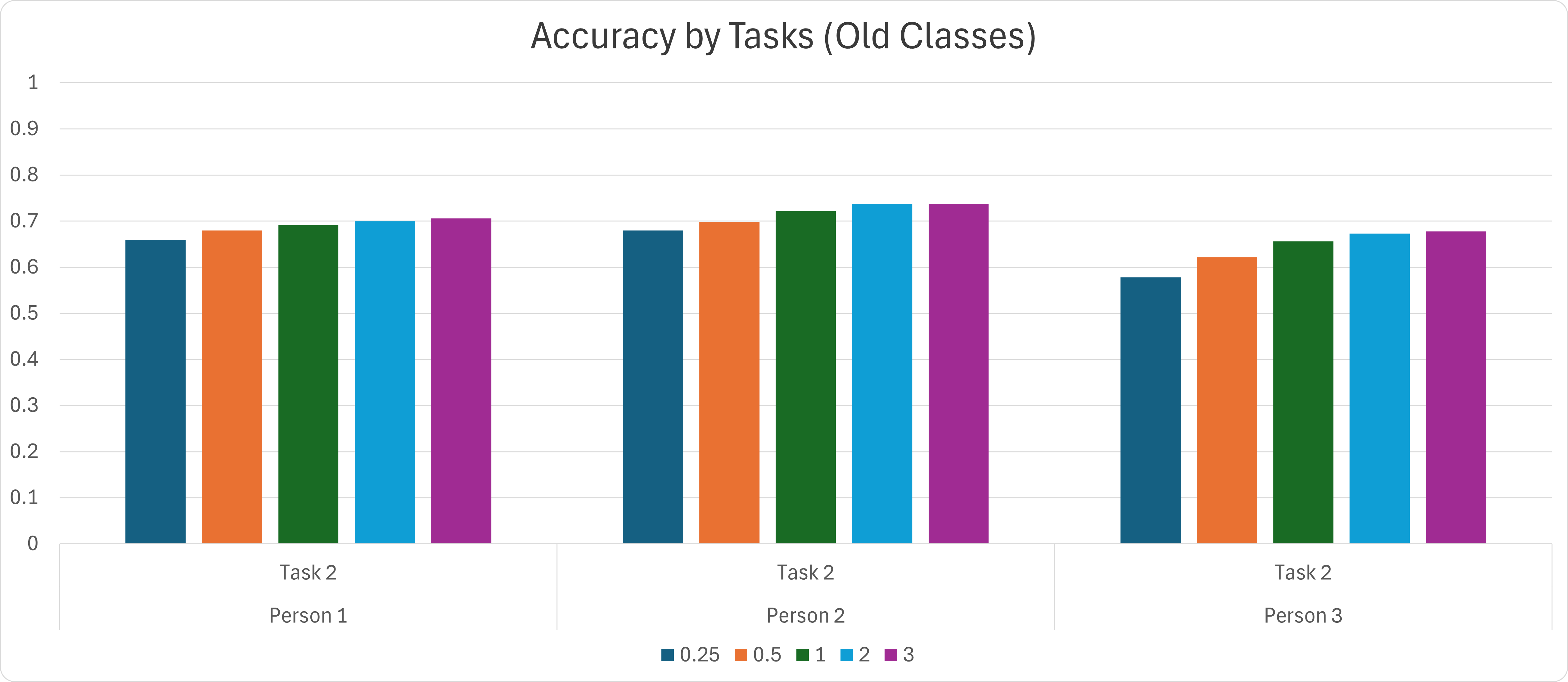
Bar Charts of Average Metrics by Tasks
The bar charts display accuracy metrics (all classes, new classes, and old classes) for participants (P0, P1, P2) over 30 runs across tasks in each scenario.
Note:
The method used in this experiment is TaskVAE-GMM with different ratios of the average training data size for new classes in each task. The ratios (0.25, 0.5, 1, 2, 3) are consistently arranged from left to right in each task, with each ratio represented by a distinct color in the legend of the graphs.
For a larger view, right-click on the image and select "Open in a new window."